Located in my hometown, this was one of the first rebranding projects I took up.

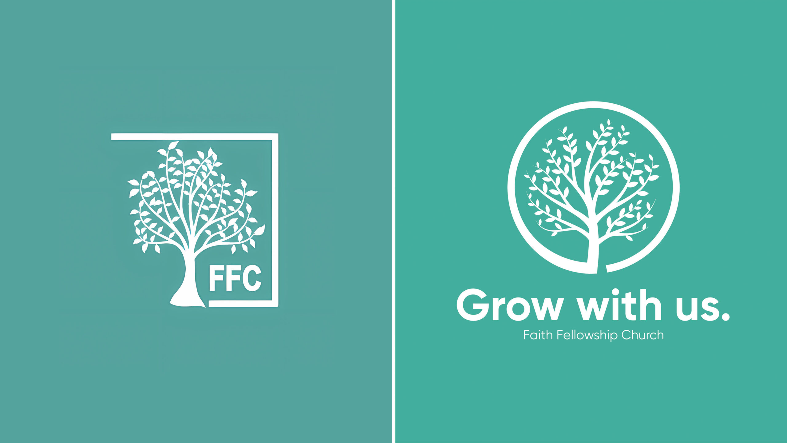
Their original logo, while it served them well, was made back when the church first began–thirty years ago. The vibrant color in the new branding displays better on digital screens, while the rounded frame for the tree looks friendlier and fits well as a profile photo. The new tagline calls back to the church’s fledgling status in the community, while also signaling itself as a place where young families can settle. Grow with us.


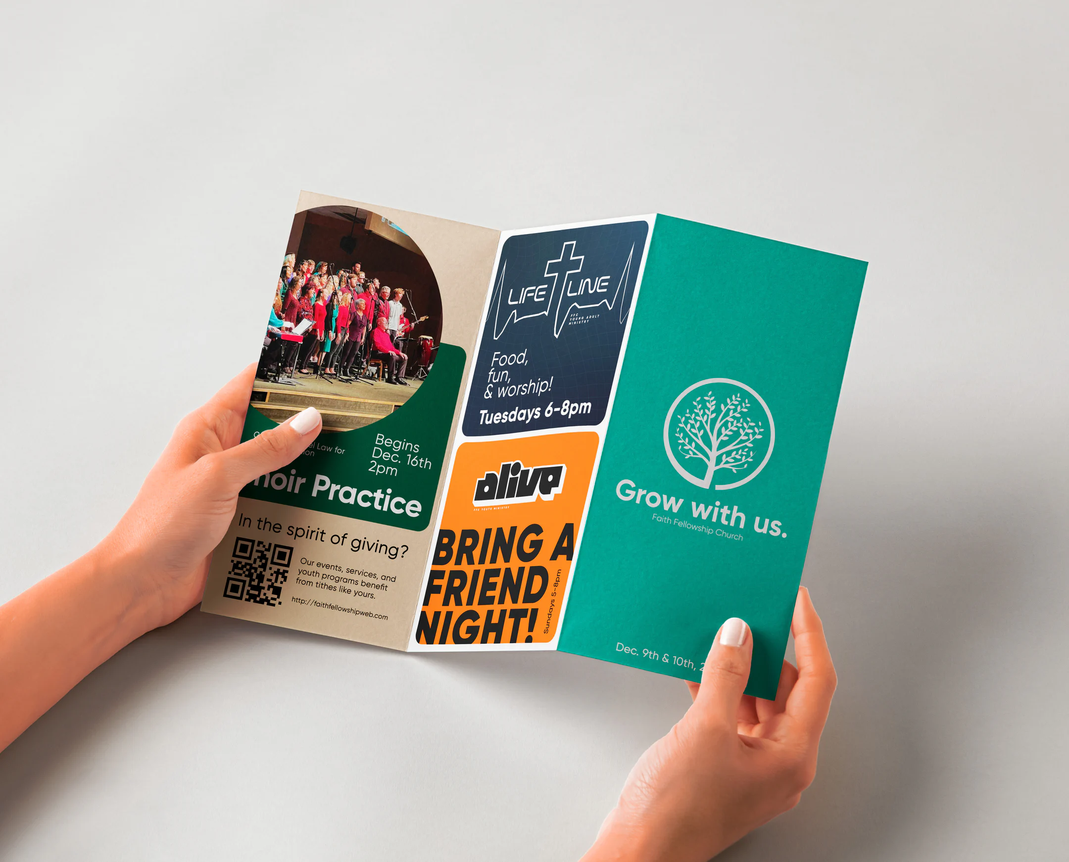
As part of the rebranding process, I wanted to focus on word of mouth, giving congregation members something to physically pass on to nonmembers. I opted for a pamphlet that creatively displays all the events happening each week; something people are excited to look at.